Monday, August 29, 2011

Project Review: Gulliver's Travels 2010 PART II

The final Back Rack Shot where Jack Black, as Gulliver, was comped into this three layer file in Photoshop.


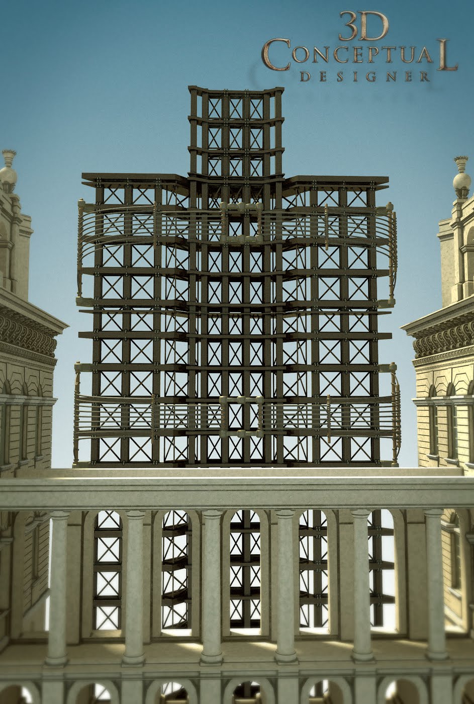
A Quad Geometry view of the Back Rack Model I re-created from the film for these Poster Comps.[ Mesh-smooth is OFF]


The Stepping over Idea emphasized his large scale by having him rest his sneaker on the castle itself.


A front view, low angle "step Over" comp idea I did for Gulliver's Travels One Sheet presentation back in 2010.


For this "step over" comp idea Gulliver has his foot resting up on the overpass of this part of the castle.


For this shot Jack Black's character Gulliver, is conversing with someone on the ledge of the castle tower.


Here is the base castle facade geometry I designed for Peter Stark for the concepts presented.


Project Review
Gulliver's Travels 2010
PART II: 3D IllustrationLink

Client: Twentieth Century FOX Film Corp. via BLT and Associates.
Creative Director: Peter Stark.
Project Date Fall 2010.

In my second post for Gullivers Travels, today I have posted the 3D Illustration that I did last year for the advertising pitches done for BLT and Associates.

The first step is, I had to find out where they were shooting in England ,and get reference for the actual castle used beyond what I had from the film, so I could accurately built the facade.

Next step was to nail down what parts were needed, as building every brick was too much for these posters, so we focused on the courtyard area and I built one side.

I first create a vector line-art file that is done to nail down the proportions of the building to be built before I begin construction. I then build around this file and delete it once I am blocked in.

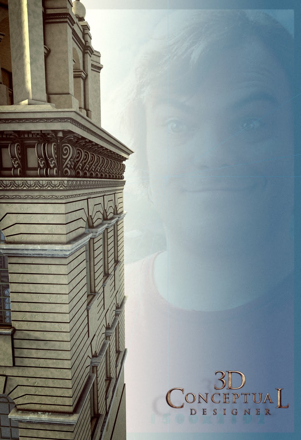
I was also provided the base photo they wanted to use for perspective angle and lighting needed for me to match up, and you can see this image ghosted in the backgrounds of a few images above.

A very fun project with a company that embraced 3D Illustration very early on , over a decade back in Theatrical Advertising when I was still in-house, and they still lead with integration of 3D Illustrations with stock photography use.

Cheers, THOM

Friday, August 26, 2011

Project Review: Gulliver's Travels 2010 PART I


Here is the first Logo I did for Gulliver's Travels in 2010, it was playing off the Teaser Poster with Jack Black[ Gulliver] tied down on the sandy beach, this was a One Sheet proportioned 3D Logo Illustration.


Here is the same concept modified as a 30-sheet billboard single line of text with the same sand and straps from the above conceptual design I did.


This was a constructed logo using various plates and parts which was based on the production design in the film where all the "BIG" stuff like the chair was made from thousands of little parts so the logo had a lot of breaking up into sub-parts for the renders. This one also used a bit of fish-eye curve in the lens.


Here is a similar version with some light modifications done as a basic front view at camera shot.


A close-up of the geometry reveals the construction of the fill squares along with the corned retails ladders etc in the design, all as second read elements.


Here is the overall view of the geometry I designed for Peter Stark for the concepts presented.


Project Review
Gulliver's Travels 2010
PART I: 3D Logo Concept DesignsLink

Client: Twentieth Century FOX Film Corp. via BLT and Associates.
Creative Director: Peter Stark.
Project Date Fall 2010.

I started my Theatrical Advertising career at BLT back in 2001, so to be able to return as a freelancer years later to help out was a real pleasure for me. They are in great hands as my colleague from Art Center, the talented Roddy Navvaro, took over the department when I left and remains there with a good sized staff for the continued 3D needs they have.

I was called in for a bit of overflow 3D work on Gulliver's Travels, and this is the first of two parts on the job that I did for Creative Director Peter Stark.

The first part I am covering today, are a few fun 3D logos for the poster concepts, and though it did not finish, and make it to the finals, it was a fun design process, and a good finished comp presentation none the less.

My First executed concept was to make all the letters in 3D and move them around a bit like blocks of ancient ruins, all the while being held down with the iconic ropes, as we see thrown over Gulliver's own body in the posters and the books.

I also did a logo made from various plates of brass, bronze, and copper to form these letters that also would have the Liliputian's on ladders[ see image], and inside cleaning and adjusting the text for the comp. The scale of having these miniature folks all over the logo was consistent with both designs.

Look for part II coming soon, where I cover the 3D Virtual Sets I built of the Castle Itself, so Jack Black could be comped into the various shots with the building at the right angle and lighting to match up for each concept from the Creative Director.

Cheers, THOM


Thursday, August 25, 2011

Project Review: M&M's World Vegas PART III

I found a Xerox of the first pass at the final capsule design for the Swirly gag at the M&M's attraction, this was the final lineart drawing submitted for manufacture.


This is a re-post, but a new image of this, as I found a better scan of it, so here is the shaded version of the above final prop I designed back in 1996 for Landmark Entertainment Group.


The final Color-key I did as a marker, chalk, and pencil sketch showing the fabrication team the colors we required for the prop design.


This concept which was deemed, "too messy" as they wanted to squirt water in arches over the guests having them land back in the unit on the other side. Problem was folks stuck their hands out and everyone get very wet, so we canned it in as seen above.


Project Review: M&M's World Vegas PART III
Swirly Design Concepts

Client: Ethel M Chocolates via The Landmark Entertainment Group.
Art Director: Michael Marquez
Date: Summer 1998

As a Designer I often design something that will be manufactured. Illustration captures an image or a look, or even a design intent, but Production Design involves Architecture, Engineering, Manufacturing and a working out in real world conditions a design inten for construction, in other words, can it be built effectively for the budget and time allotted. If not you FAIL, even a good design will fail if it cannot be built for the cost and time allotted and illustration does not have l this limitation.

So above you can see a few concepts for a swirly machine at the M&M's attraction in Las Vegas that I designed. The first sketch has a whirlpool of water int he top and a nozzle that would shoot water over the guests as the took the tour, but that was modified to the tall capsule design you see above. I included the three main Illustrations that I created for the design intent.

First a line-art 2D sketched drawing of the design goes in, if that is good to go, I do a quick shaded sketch showing form and volume. And finally, I execute the color key to show the finishes to the Creative Director, unless that is me then it goes to the client.

I have two prior posts on M&M's here for PART I and here for PART II.

Cheers, THOM

Wednesday, August 24, 2011

Project Review: Sherlock Holmes 2008

The first Logo I designed for Sherlock Holmes was the most simple of the three I did. This was done in a cool metal used on the X-Men 3 poster I built.


Here was the warm version done with brass aged bronze and amber art glass. I put the center of Big Ben that I had constructed prior in the center of the logo holding device and lit the glass up there too.


This last version had both the warm glass, though not lit up, and some cool lower lighting with a bit of blue/green in it to match the look of the the film as it was treated with some cooled tones in aging the look so we followed suit with the poster artwork.


Here is the model I built, using filigree from the Venetian project and a few sub-D parts including the type and main holding device.


A monogrammed Magnifying Glass I designed for the Poster Ideas we pitched for Sherlock Holmes in 2008.


Here you can see the Low Poly, and the High Poly smoothed model I built for the comp.


Project Review
Sherlock Holmes 2008

Client: via The Cimarron Group.
Art Director(s): Joseph Stamper, Calvin Sumler, and Chris A. Hawkins.
Project Date: November 2008.

I would have loved to have had a few weeks to work on this property as it was an intriguing concept and beautiful production design, so to help develop a period piece logo I was amped. I was given a single day, typical to about 80% of my theatrical work pace. While at The Cimarron Group in Hollywood back in 2008, I was given the task of developing a few logos for the soon to be released Guy Richie film Sherlock Holmes.

I had become very familiar with Art Nouveau back in the 90's while working on the restaurant design in Beverly Hills for Cafe Morpheus, so I learned all about Alphonse Mucha and his wonderful and amazing line work from his posters for that era. I found a small filigree element in a few concepts that I used as the starting point to build out the medallion you see above in the logos. I modified the Single Point Beveled text I had built for Valkyrie out of Trajen and added some Nouveau flair by moving the center up and the tails down.

We also had a huge close up of Robert Downey Jr's eye, and they needed a magnifying glass to overlay onto the comp so I created that prop design above, with some detailed 3D filigree as well.

The filigree actually was a re-use of some architectural parts I built at Cimarron for The Venetian Casino a year or so prior. Enjoy the posting.

Cheers, THOM

Tuesday, August 23, 2011

Tutorial Tuesday: How to Model a Single Point Bevel Part I

STEP I
A Live font as a spline of the logo, save this as the first version.


STEP II
Copy and convert the live-spline to an editable spline and evaluate the vertex and geometry needs.


STEP III
Add in the vertices and rebuild any parts for symmetry and clean up. The more you do at this stage the easier.


STEP IV
Verify the type is to put on the stock bevel modifier and put a bevel on it to see if t any corners cross over or the holes are plugged[ revers or double splines], and continue to clean until it looks right.


STEP V
Once the spline is verified, remove the "caps" front and back so it is just the extrusion, and the bevel, then convert it to an editable polygon object.


STEP VI
Stitching as I call it is the process of selecting the vertices that will be collapsed or welded together to create the point in this Single Pointed Bevel type treatment. This is the LONGEST stage, and depending on the font I have spent 80-90% of the time here.


STEP VII
At this stage I put a quick smooth modifier to remove smoothing artifacts so I can clearly see the font and the bevels to make sure I did not miss anything.


STEP VIII
At this stage you select all edges that you want to have sharp as you will be doubling them up in STEP IV, with a small chamfered bevel.
NOTE: Save all steps but this one is vital as you will come back to this step to create multiple looks


STEP IV
Adding the small bevel or chamfer to the edges desired to be sharp. This is the fasted step in adding bevel to the selected splines. Save as a version as well.


STEP X
You put on a subdivision modifier like a Turbo-smooth or Mesh-Smooth to verify the bevels and that you did not miss a corner. If you did just go back two steps to the saved file and adjust.
Also at this stage we see the longer faces on the legs of the type as the smoothing is stitched out over some long faces, and with GI renderers needing square faces you will want to add in some extra polys next and remove the smooth for that.


STEP XI
Cutting the polygons in the legs to have a few more divisions. I use the slice plane modifier under editable poly, but you can also chamfer the edges in the legs as well.


STEP XII
Here is the model smoothed with two iterations with everything done to have a simple single pointed beveled font with sharp sides like chiseled rock or metal.

Tutorial Tuesday
3D Logo Construction
How to Model a Single Point Bevel
Part I

Since I began doing 3D Logos for film and television back in 2000, I have seen a need for the Single Point Beveled [SPB] type treatment. As a user of 3DS max, I have always had both spline objects, as well as a great simple bevel modifier, built right into max that is super simple and easy to create a typical beveled and extruded text, but once the lines cross in the middle of the text face, there are issues with the geometry, as the program must cut the bevels to not cross over, and you get very problematic results.

My first hand modeled SPB, was done while at BLT and associates near the end of my 3 years there starting up their 3D department which is still going strong. I did that logo for the film, TROY. I built that title, that was animated by Matt Hartle for the trailers for the film. I was not a sub-D modeler at the time yet, so I built the type all high resolution since we flew through the font in the trailers so the rounds needed plenty of segmentation. Each letter took about an hour or so to model, but the technique I learned in this time intensive exercise created the groundwork for the Sub-D method I use now.

Above you can see the twelve steps involved with building a typical single point bevel. when you want the bevel to meet in the top center of the face, to a single point, thus having no real flat spot on top this method will work well with all fonts both serifed, and sans-serifed.

I will have additional tutorials in the weeks to come on various techniques I use to create in 3D, as well as some expansion on the SPB too.

Cheers, THOM


Monday, August 22, 2011

Project Review: Motion Graphics Work for School for Scoundrels 2006

The client provided the Logo for the film up front so we basically developed a few looks in 2D and 3D using the font and colors we were directed with as seen in the beveled font I made.


This was a fun little concept of having the chalkboard have film footage on the back and it flips around to reveal the title in chalk on it[ then erased off]...


Here is a close up of the mechanism I built for the chalkboard. Though a simple scene I go to into detail on any part that may be used in a close up shot as this was boarded to have. All parts were built as BREP/NURBS as this was prior to my Quad Sub-D development, and this had a super fast turn around time so I quickly built this out.


I designed and conceptualized out an Old 70's Door to a classroom with faux wood and the steel framed wire reinforced window that has a bullet hole in it. Lots of details for a simple little shot, but way too much fun to do.


A close up showing the model details for the chicken wire inside the glass with the hand drawn then modeled bullet hole in the window.


An exploded view of the parts involved with the swinging door animation I did for Motion Graphics.


Nothing says School like a Number 2 pencil, and I had built one in the past here and here, so I remade this one with the logo cut into the yellow. We discussed having the pencil break in half and shatter into thousands of particles, but the basic concept was scrapped early on.


Project Review
School for Scoundrels 2006
Motion Graphic Concepts for Title treatments

Client: Metro-Goldwyn-Mayer;MGM via The Cimarron Group.
Art Director: n/a.
Project Date: Spring and Summer 2006.

Todd Phillips directed this fun film, School for Scoundrels and I had the pleasure of helping develop some Logos for the Motion Graphic work I did while running my little department at The Cimarron Group in Hollywood, CA back in 06'.

For School for Scoundrels, I came up with a few Logos that were basic fonts, and built as Single Point Bevels as seen above, but the majority were Logos built on objects or from objects themselves. I built a Pencil with the Logo in it, and a Old School door with the name on it too, and even a chalk board with the title, scribbled on the board as an animation.

Above I also am showing some of the close up's of the various parts I built for these images. I go into great detail with the scenes as we usually fly the camera through the scenes, so the glass in the door had cracks and wire modeled into it for that purpose.

Cheers, THOM

Friday, August 19, 2011

Behind the Art: 3D Toon Style Ink and Paint and Lighting Look Tests

Here is a stark toon image showing the limit of a direct light model on the Left. The bounce light is what brings the scene to life on the right. This was a very early image I did with Final Render Stage-0 back in 2001.


I took the same toon scene I designed and built a decade ago into the current version of FinalRender 3SE, and rendered out this example. I also added a turbo-smooth to a set of parts to round them out a bit for this experiment, though the scene was not a quad sub-b model the parts worked since I gave them all many segments to bend smoothly for that toon look of 'no straight edges'.


This geometry rendered view shows that I left a gap in the back room to leak light and color since the GI[ Global Illumination] takes the sky outside into consideration. I also blocked off the inner room with a wall to give it that darkness with almost all indirect light.


This Camera view shows the segmenting I performed on the parts to get them to bend without too much faceting on the curves. Also I latter learned that the GI renderers like even little polygons, and do not like long thin ones, so segmentation is the norm for me.


Here is an image from a decade ago using a toon shader plug in to achieve some various looks in the little toon scene I made.

Behind the Art
Toon Style Ink and Paint and Lighting Look Tests


Back in 2001 Global Illumination 3D Rendering was just starting to come out 'en mas, and Final Render for 3DS max had just come out. I had built out a little 3D set to test out some ink and paint looks and when the indirect lighting ability was added I jumped on it and was an early adopter, and immediately began experimentation with various scenes I had built to see the looks we could get.

Above you can see the basic structure of the toon styled room I designed and made. the fun shapes and exaggerated bends to soften up the hard edges to a toon world. I then experimented with a few looks with too shading with an ink and paint outline and some various fills including some textured passes.

I keep the scene as a base for various experiments and renderers to test to the speed etc. One way to keep your skills evolving is to use them constantly. Open up a scene and play around even more, keep going. Every hour in 3D you will learn something and have a good take away for the next round. Enjoy folks.

Cheers, THOM

Thursday, August 18, 2011

Project Review: The Phantom 2040- PARTLXXVI [76]-Main Character Design Adjustments

Sean-One was the tallest character as he lived in a space station so with zero gravity he got even taller. This is the overlay I did to bring the shapes of his suit to conform with the designs I did for the B.I.O.T.'s in the show. Here he is in color.


Vaingloria was the 2040 version of Madonna, with songs sung by Debbie Harry from Blonde fame. I added more curves to the outfit and then did the color key.


Not much to do with Sagan Cruz, so I added a wrapping and interlocking holster to her outfit and adjusted the boot design slightly with some louvered details.
Hey, I did go to Car Design school so if I can punch in a few louvers I will! :o)


Dr. Jak, our 2040 Howard Stern was voiced by Mark Hamill, know as Mr. Skywalker to those of us old enough to have been there in 76'. I modified his outfit and added wraps etc to his look.


Guran, Kit Walkers sidekick and mentor, he a had slight adjusting as well and some two piece boot designed to add in the interlocking look to him. Here he is in color.


Phantom 2040-PART LXXV [76th]
Main Character Design Adjustments


Client: Hearst Animation Productions.
Art Director: Myself.
Project Date Spring 1993.

In this, my 76th post on the Hearst Animation Productions hit, The Phantom 2040, a television animated show from 1995. I have posted today the design overlay drawing that I did for some of the main characters for the show.

Before I worked at Hearst Animation Productions, they had contracted work out to Peter Chung as his MTV hit, Aeon Flux was at it's peak back in 93', and they wanted to develop The Phantom in this new gaunt look that he developed for those characters. Peter had provided design sketches for all the main characters, and once his contract work was done, they began to develop the city backgrounds using Paul Lasaine for this work.

Once I came in 1993, due to the recommendation of Paul Lasaine, I developed a basic theme for the show, and this was first based on the proportions of Peters characters, and secondly I had just finished a themed restaurant in Beverly Hills and I was well versed in a few Architectural styles and so I went with my new found Arch-Love, Art Nouveau.

I felt the wrapping and interlocking floral fluid shapes would be a great theme for Sci-Fi, as most has been in the "Nurnies" look made famous with Star Wars with big geometry shapes covers with tons of little tiny unrecognizable details. I pitched something a bit different, and they liked it!

So, Rather than a actual real-life proportion of an 8 head tall character, I did 12-15 head tall characters and made them all gaunt thin. This combined with Art Nouveau as the architectural world, and we start to see The Phantom 2040 look come together.

The last big piece was the stretched tall and thin theme, and this came directly from when I was a kid. If you have ever seen a Cinema-Scope 70mm film squished on an old TV you will remember how thin everyone was, and this was the look I was after. I wanted the doors to look like mail slots in the walls where these overly gaunt creatures would live. A very different world indeed.

So these are simple overlays that I did to slightly modify the outfits of the designs done by Peter. These were designed a year prior to me coming onto the project as Art Director and Conceptual Designer, so I adjusted the shapes a bit, to add in an Art Nouveau feel as well as just some basic art adjusting.

There is a TAG on the list to the RIGHT for other Phantom 2o4o entry's, but you can click this as well.

Cheers, THOM