Monday, October 31, 2011

Personal Project: The Akira Kaneda Bike: A Re-Visioned redesign 1.0

 Here is the base mock-up pf the bike[ half day] rendered in Quads for massing.


 A front 3/4 view with the massive springer front end on Kanedas Bike prominent in the design.


 A rear 3/4 view pf the Akira Bike Re visioned, showing the single sided swing arm rear area with the shock mount exposed as well.

 
 A simple side view, a bit high up, of the Akira Bike Re-Visions internal structure.


 The base parts exploded out in this view of the Akira Re-Vision.


Personal Project
Kaneda's Bike for AKIRA
A re visioning Experiment.

Akira holds a close spot for all Art Center Grads like myself, it is a must see film required by all Transportation majors informally in the program. Simply put, it is a masterpiece.

My associate Dean Fowler over at Machine Films, offered me an invitation to join in Project Akira he is on to develop a "what if", from me. Every transportation design major, has envisioned this bike at some point in their career, it is a perfect fun package, with a full recline sit down rocket bike, what could be more fun!

I am an avid biker and after having owned a Ducati, I am a huge fan of using the frame itself as a main focus of the design, not hidden as in the original but much more a Hooligan or 'naked" bike as they call it in motorsports, so that is where I started.

As with all transportation projects, I started with the base 95th percentile male figure, seated him, and built the frame around him to the close proportions of the original adjusting to allow the bike to actually function as a real vehicle, to fit the engine and items needed to ride this beast. 

I am building this out all as an all subdivision surface model, so what you see is the blocking Low-Poly views showing the base design elements from the hyper springer front end, to the tipped V twin 150ci down low, to the single sided swing arm with internal oil tank. 

The finals will be as close to the stylized Photo Real I do for most all my projects

This is just a first post, as I have about a half day into the project, and thought I'd post this early, so I can show regular updates as I revisit the design and you can follow the progress.

        Cheers, THOM

Friday, October 28, 2011

Project Review: Green Lantern- Key Art 2010


 The Iconic Lantern for the films One Sheet was designed by someone else, yet I had to replicate it for a Poster alt as show here.


 All rough metal Green Lantern Logo with type and the lantern layered for the client.


 A Green Lantern Title with a holding device plate of bevels metal done in 3D for the Key Art presentations.


 This is an Alt on the above font without the background plate, and I extruded it way back and pulled the end down to exaggerate the forced One-point perspective look they were after.


 The client requested a Generic blurred soft chrome look for the Green Lantern Logo in 3D


 A Green Lantern Logo with a tint of green to the rusted metal plates.


Project Review
Green Lantern 2010
3D Logo exploration for Key Art Presentations

Clinet: via Art Machine A Trailer Park Company.
Art Director Rigel Morrison.
Project Date: December 2010.

This is the frist job I did for Art Machine back about one year ago, for the Superhero flic Green Lantern, currently on Demand now, so I thought I'd post the Logos I did.

This was a relatively short project, and I spent a bit on the Lantern Icon first, as I had to match texture and lighting to someone elses 3D image, and they had no access to the files.

A good portion of the work I do is to "re-do" a logo that existed in a 3D form, yet is not available to us for the alt. Sometimes, like with this, it needed to match very close, but in most cases,  I am given a bit more room to explore, but this was late in the game and the client just wanted an alternate view.

I then jumped to do about ten, or so 3D logos for the film. I have done a few dozen Superhero logos in the recent past, so this is a standard request I get, and with the popularity of Superheros as the source for films, I get a good amount of these fine jobs.

Funny I did Green Hornet and Green Lantern work the dame week!

Cheers, THOM


Thursday, October 27, 2011

Project Review: The Phantom 2040- PARTLXXXIV [84th]-Misc Color Key Marker Rendering


 One of many Accessories that our hero, The Phantom, has concealed in his outfits Power-Cuffs, a video card design.


 A Tablet Palm PC[ Hey it was 1994!], with a stylus pen...


 A Color Key I did in Markers for a small generic Electric vehicle for The show, The Phantom 2040.


 A Color Key I did for The Phantom 2040, and this was a revision of the first draft design for Maxwell Madison's Hyper Cruiser.


Phantom 2040-PART LXXXIV [84th]
Misc. Color Key Marker Rendering


Client: Hearst Animation Productions.
Art Director: Myself.
Project Date Spring 1993.


This is my 84th posting here on my design blog for my contributions of Art Direction, and Head Conceptual Designer roles for The Phantom 2040, and today I am posting some added color keys that I did with markers for the show development.

I am trained in marker rendering as all Transportation Designers were back before the advent of digital rendering, so it was natural to so this for the color key work. It works quickly in markers and pencil, and since this show was digitally ink-n-painted anyhow the medium was not an issue the color most certainly was, and we scanned it all in for the South Korean Studio to finish..

I originally was directed to make sure I used Purple[ Te Phantom Signature color], as well as green to show the Ghost Jungle, at least in color for a city centered series with metal and cement as the main materials.

You will see this influence in all the Color Keys I did, though we muted the color a lot as we headed to production.

If you are a FAN of The Phantom 2040, and on FACEBOOK, there is a group dedicated to the show here.

There is a TAG on the list to the RIGHT for other Phantom 2o4o entry's, but you can click this as well.

Cheers, THOM

Wednesday, October 26, 2011

Project Review: Spongebob Squarepants Movie 2003: Key Art 3D Logos and 3D Illustrations PT-II

 Square bubbles go with "Squarepants", 'nuff said...


 We did an alt with water filled letters like the "Big Fish" logo I did like this.


 So the underwater architecture is from Tomb Raider, and the doorway from Gosford Park used to show some "Atlantis" ruins underwater with the logo put into it.


 I had also built a full divers helmet but here is one of the portholes I built using Npower BREP object construction back when it was in version 1.0.


 Here is the show logo without any water etc.[ clean]

 Project Review
Spongebob Squarepants Movie 2003
Key Art 3D Logos and 3D Illustrations
PART II

Client: Nickelodeon via BLT and Associates.
Art Director: Dawn Baillie, and Coby Gewertz.
Project Date: Summer 2003.


In this second post showing some more of the 3D logo's and 3D Illustrations I did for the various Movie Poster Comp Ideas presented to Nickelodeon I have five added images to review.

In the first post I covered the sponge material that I was able to use with  Sub surface scattering , and today I will show a wider range of 3D Illustrations.
 
Soft Square air bubbles with the "toon" window reflection was one exercise I did both as a profile, and as more dimensional blocks for Coby Gewertz, and that concept went all the way to a finish [ International]. I also built a full divers helmet once they saw the porthole I did first above in orange[ Nick orange!].

If you follow my posts you will see the re-use of some architectural items in the ruins scene from above as well. This was one of the final projects I worked on before leaving in 2003, I had a blast doing 3D design and illustrations for them there a great group.

Cheers, THOM

Tuesday, October 25, 2011

Napkin Sketching and Doodles: PART XI-More Character Design Sketches.

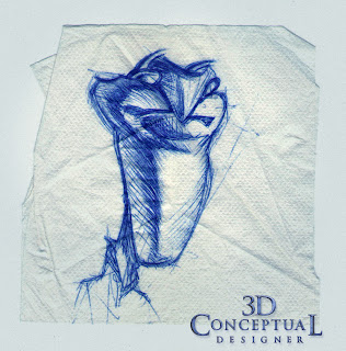
 This little abstract 3D design was to be a sculpt I was going to execute in 3D as a soft sculpt.


 A dude with shaved sides of his head and a blocky head proportion.


 I was really focusing on the volumes in this design with all the shading. Some Designs are mere line-work, this was volumetric.


A Triangle was the basis for the proportions on this chap. Not sure what the floating "dot" off the chin was a goatee?

Sketching Part XI
More Character Design Napkin Sketches
 In this eleventh installment of the Napkin Sketches, Drawings, and Doodles I do during times of relaxation I have posted more designs I have done for various characters while sitting down in Pasadena's Old Towne.

Character design has all the qualities of any other design project, in that you want to identify a theme or look to the character, but what makes characters so different is the emotions they evoke when being critiqued. Characters come to life, so what the eyes look like, says more about a tone than the design itself.

I have found that when designing a character you must be ready for a very different kind of design adjustment. Apart form the starting point, is is round thin tall melted etc, every design still must take into consideration what the actor must do. Will it talk, dance, or just be static virtual photo. All this is considered at the design time, and even a  still image of a character will be made alive by the viewer when they see it, it is natural to any character, especially anyone they can relate to.

As a side I am an avid "people watcher", and every character I draw in public is inspired by some real life person I just saw before I begin the design.

Draw often!

You can view the other parts as follows:

PART I

PART II

PART III

PART IV

PART V

PART VI

PART VII

PART VIII

PART IX 
PART X

Cheers, THOM

Monday, October 24, 2011

Project Review: Spongebob Squarepants Movie 2003: Key Art 3D Logos and 3D Illustrations PT-1

 
 Here is the Life Preserver Logo sunk  halfway into the water.
 
 
 My favorite sub-Surface Sponge bob Logo was this pass as the light leaks into the sponge material on the edges and this spots.

 
 Here is a stacked block "Ben Hur" angle on a huge feeling logo made from sponge.


 A Log with Sponge, and the base "Toon-Plastic" we used on the main Logo, with the same font stacked and moved around a bit.
 
 
 A sand castle block at the bottom of the Sea was a quick visualization they wanted to look at as seen above.

 Project Review
Spongebob Squarepants Movie 2003
Key Art 3D Logos and 3D Illustrations
PART I

Client: Nickelodeon via BLT and Associates.
Art Director: Dawn Baillie, and Coby Gewertz.
Project Date: Summer 2003.


I was still in house at BLT back in the summer of 2003 doing 3D design, Illustrations, and even a small bit of Motion graphics, but my main work was Key Art 3D Illustrations for the big team they boast there.

Spongebob came in, so first I rebuilt a 3D Life Preserver Logo to match what they has as a live action prop from the Television series. I like to start where they left off it gets me into the look and shape language of what they likes and thus approved in the past. From there we bounce out into new territory with new designs.

I had a lot of fun on this project, as Sub surface scattering had just come out for GI rendering, so I practiced a bit with the sponge material for a sponge logo look. We did some fun experimentations on the project and in PART II latter  this week I will show more of the 3D work I did to contribute to this project.

Cheers, THOM

Friday, October 21, 2011

Project Review: Cirque Du Soleil-ZED

 
 The Cirque Du Soleil ZED Logo done in Copper "Tech" with the Japanese character translation below[ this finished]


 The Cirque Du Soleil ZED Logo done in Chrome with some plated metal parts in the surface texture.


 The Cirque Du Soleil ZED Logo done as a smooth SPB chrome look.


Another Cirque Du Soleil ZED Logo done in Copper, this time with a flat face and slight bevel.  

 The glass with stars look to the logo here for an "on Black" presentation.


 I built the main Set Piece from the The Cirque Du Soleil ZED show as well and this finished too.


Project Review
Cirque DU Soleil-ZED
3D Logo and Virtual Set Prop  Illustrations


Client: Cirque Du Soleil via The Cimarron Group.
Art Director: Joseph Stamper.
Project Date: September-December, 2010.

I worked on a few Cirque projects over the years and this was the last one I did have some part in. I did some single point beveled type for Cimarron for the Cirque show, ZED last year, and I have posted the main examples of what I did for the project.

The logo was designed and done by the client, and they just wanted to take the outline and play with a few looks, so Joseph Stamper converted it over and I went to work.

The show uses copper in the main "Ball Set piece", that I also replicated for the Key Art so we did a few passes with that texture and coloration. I did one glass in space with stars shining thru, as seen above, as well as a few chrome ones. They wanted a retro chrome with the warm to cool exaggerated like a old Chicago album[ remember those!].

I have a few added posts for Cirque on Banana Shpeel, and KA, here, and here.

Cheers, THOM

Wednesday, October 19, 2011

Personal Project: Arts and Crafts Bungalow Playhouse: PART II

 A close Up shot showing the East side near the front porch [ 3'x 8'].


 A 3/4 front view of the fully framed design of an America Mini-Bungalow.


 A longer view from the barn at the West side.[ See the staircase inside]


 A view from under the avocado tree showing the side door and back alley of this.


 A Direct front view of this Craftsman Bungalow Playhouse design.


 A high angle on the West side looking at the staircase inside.


 A birds eye of the tree-side to the American Bungalow Playhouse I designed.


Arts and Crafts Bungalow Playhouse.
PART II

This is my second posting on the design I did for my childs playhouse. I designed this back in 2006 as a compliment to our own home for our first daugheter.

I have posted the final design I had done for the bid for the Bungalow Playhouse I designed as a miniature of our big home a 1910 Craftsman. 

These 3D renders are the full framed out concept design with the exterior skin of siding and shingle removed to show construction technique. I love doing what I call an X-Ray model where it has all the internal guts that would be in there including electrical and all cut outs. It also helps for the parts list you can count the virtual boards needed and spin  around the final constructed design with the contractor to verify the design will be built accurate.

Enjoy the post. You can view the prior post here.

Cheers, THOM

Tuesday, October 18, 2011

My Art Center Senior Show from the Fall Trimester of 1991

 Here is the longview on my Senior Show FA 1991 from Art Center in Pasadena CA.


 My show was next to class mate Paul Kirley, and a few classmates were there assisting when I took this pic. I graduated with Doug as well, but Darren was in a grad program[ I believe] and had already graduated.
 

 My CALTY[ California-Toyota-Design Lab] project form my 7th term.


 A shot of the wall with my Alfa Romeo and Calty flanking the sides.


 Here is my Bubble Car as well as my Telescope Product design I teamed on with Aaron Kahleberg as well as my Motorized Speed skates!


My Art Center Senior Show from the Fall Trimester of 1991

Upon graduation from Transportation Design at ACCD, we get the opportunity to do a Senior show in the main Project Room that we work our clay models up in during the year.

Since our calss was just five folks, we each got a full wall, and the 5th got the center of the room. What you see above is my full wall with four, fifth scale car models I designed and built in school, the Telescope Product Design Model, My Theme Park Vehicle "Sunset", and my Motorized Speedskate project. 

I put up over 100 pieces on the walls as well as 12 sketch books.

We also get to interview with automotive and transportation companies even if we are going in another filed, as I was intent on Entertainment Design since I transferred in 85'. It was a fun process.

I have nine posts for my time at Art Center here is a quick link to them all.

Cheers, THOM

Monday, October 17, 2011

Project Review: The THING 2011-3D Title Design for Key Art

 One of my favorite designs was this one in a pit in the ice sheets, with the snow around the edges Photoshoped to soften edges to save time so I "blocked in the snow" with a simple edge as seen here.


 Here is the quad geometry view showing the three main objects. You can see the letter hole cut into the ice block for accurate refractions in the ice material.


  This second design I did for The Thing, was the logo on a gloss black surface with Ice chips all around. I built the type soft with some melting, shifting the individual blocks a bit forward or tilted back for variety.


 Here is the mesh view with the smooth on so you can see that I used a Pro-Boolean in 3DSmax to achieve the full quad division on the type so it would take the Global Illumination better.
 

 The last comp logo I did for The Thing was an angled block behind the type, but it was still imbedded into the block. I cut this out too, so you could see the back side blurred through the ice material.


 Here is that same scene from above exploded out to show the various parts.
[ the chips were deleted in the final]


Project Review
The THING 2011
3D Title Design for Key Art

Client: Universal Pictures via Cold Open.
Art Direction: Gardner DeFranceaux.
Project Date: October 2010.

A year back I did some a quick project with experimentation for some 3D Logos build or carved out from solid ICE for the remake or prequel The Thing.

The current film is a prequel to the 1985 film[ itself a re-make], and the 'Thing' itself in the film is found in a solid block of ice, so that was the basic theme for the type. A big block letter logo carved out of Ice or imbedded into an ice block.

I also included in this posting a quad view showing the parts I built, and I will note that when you make anything transparent, the more accurate you build it in 3D as a model[ no fakes], the better the render comes out. I made the text cuts in the ice and placed the type into a hole. Typically in 3D you just push the type into the back object, but being translucent, I wanted the render to look like ice in ice and have the proper refraction and reflections so I made them separate.

Cheers, THOM